A Minimalist Template for Academic Papers
Formatting academic papers so they are easy to scan and easy to read.
Although academic papers are eventually formatted by their publishers, it is important to format preprints (pre-publication papers) well to disseminate their message effectively. A well-formatted preprint should be easy to read, of course, but also easy to scan. Many scientists look at papers in search of specific results, methods, or references—those should be easy to find.
Having well-formatted preprints is especially important in fields in which papers remain at the preprint stage for years before being published—economics for instance. Most people will read your paper at the preprint stage, not in its published form. It is therefore key to have journal-quality, or above-journal-quality formatting. (Elsevier’s journals are notoriously ugly and difficult to read: you want to aim higher than that.)
In a previous post, I shared a minimalist template to write academic presentations with LateX Beamer and offered some guidelines to format academic presentations. In this second post on academic typography, I share a minimalist template to write academic papers with LaTeX.1
Downloading the template
The paper template is freely available on GitHub. The GitHub repository contains the paper template, accompanying style files (for the paper and bibliography), a paper example, and a readme file explaining how to use the template. The template produces a paper using LaTeX.
Title page
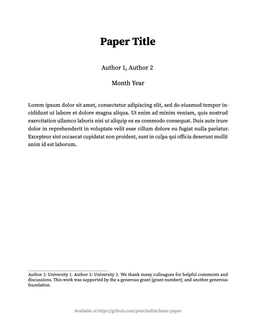
The template’s title page looks like this:
It is pretty minimalist but contains all the required information: title, authors, date, abstract, affiliations, and acknowledgements. You can specify an URL for the paper, which allows readers to go easily to the latest version of the paper.
Text font
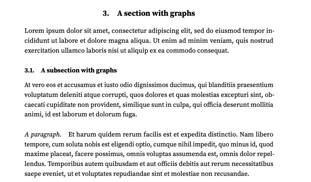
The font determines the appearance and readability of the entire paper, so choosing a good font is key. Matthew Butterick has a nice introduction to font choice. Based on Butterick’s advice, I chose Source Serif Pro for the template. Source Serif Pro is a serif font—a typical choice for long-form writing. Source Serif Pro is not part of typical paper templates (unlike Times New Roman or Palatino), so it has a new, fresh feel. And since Source Serif Pro was designed in the last decade, it also has a modern feel.
Text in the paper looks like this:
Math font
LaTeX uses one font for text and other fonts for math. For consistency, the template sticks with Source Serif Pro for roman math. It also uses Source Serif Pro for all the numbers in math. This way you do not get different-looking numbers if you type 2.5 or $2.5$.
For the Greek letters in math, the template uses the Euler font. These Greek letters look good, have the same thickness and height as the text letters, and are distinctive.
The template also uses the Euler font for calligraphic letters in math. This calligraphic letters fit well with the other fonts and are very readable.
Finally, the template uses a simple geometric sans-serif font as blackboard bold font. It is cleaner than the default blackboard bold font.
Mathematical expressions in the paper look like this:
Font size, spacing, margins
The font size is 12pt, which is standard. It is easily readable but not too big. (See also Butterick’s discussion of font sizes.)
The spacing is 150% of the point size. This is in line with Butterick’s advice. This avoids that the text is too cramped or too spread out.
The margins are 1.1 inch. This provides a bit a white space on the page. Furthermore, with such margins, there are always 80–90 characters per line, just as Butterick recommends. (Longer lines are harder to read.)
Headings
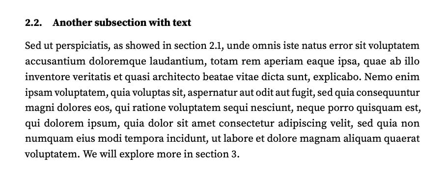
The template’s headings follow Butterick’s advice. Section headings are a bit larger and bold. Subsection headings are bold. And paragraph headings are just italic (I use a lot of paragraph headings so I did not want them to be too prominent). To clearly separate sections, I also opted to center section headings (just like the paper title).
I would not recommend using subsubsections and smaller headings in a paper—they are a sign that the paper’s organization is too messy. Accordingly the template does not tailor formatting for these headings.
The collection of headings looks like this:
Color scheme
As Butterick says, use color with restraint. A lot of colors, especially bright ones, are distracting. Furthermore, many colors are hard to read when they are printed in black & white. To reduce distraction, and to have a paper that prints well, the template only uses the color black for text.
Figures
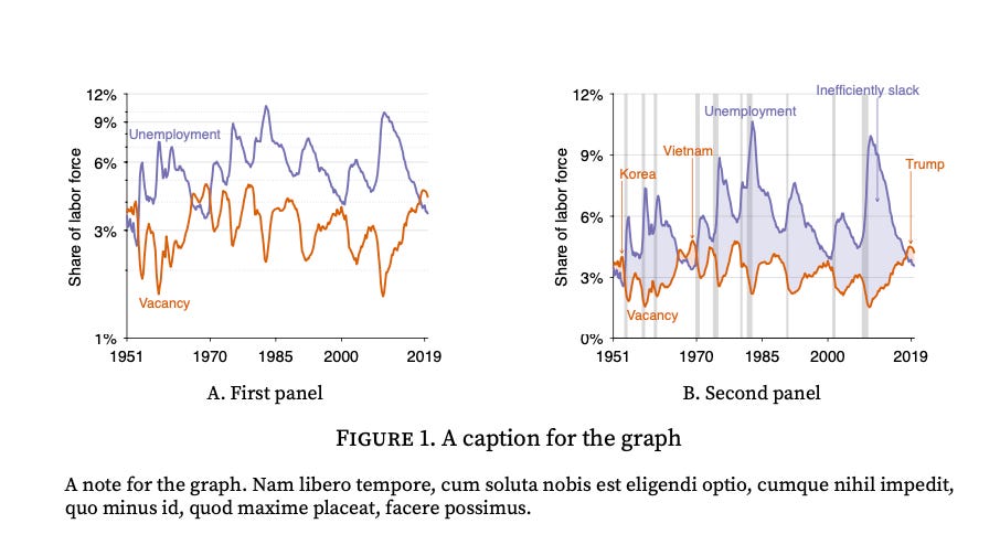
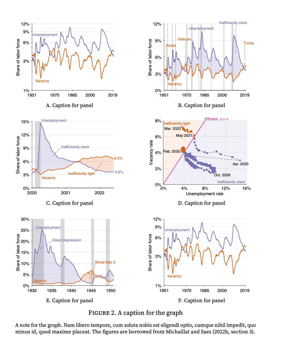
An advantage of avoiding colors in the text is that the colors in figures really stand out. Here is a figure with two panels produced by the template:
The graphs above are produced with Matlab. I use a sans-serif font (Helvetica) for the text in the graphs to improves readability. I chose the font size in the graphs so the text in the graph is about the same size as footnote text. This way you are sure that the figure will be easily readable (smaller text would be difficult to read).
The figure environment is set up so you can reference a figure (figure 1) or directly a panel (figure 1A). It also allows you to enter a note below the figure caption with details about the figure and sources.
A figure with two panels fits well at the top of a page. A figure with four or six panels fits on a whole page:
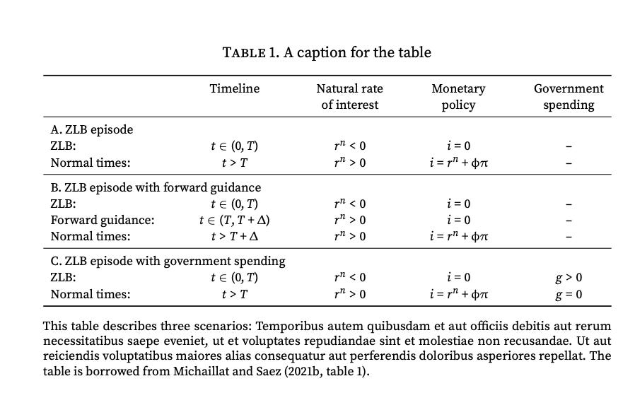
Tables
It is very easy to produce tables with the template. A table looks like this:
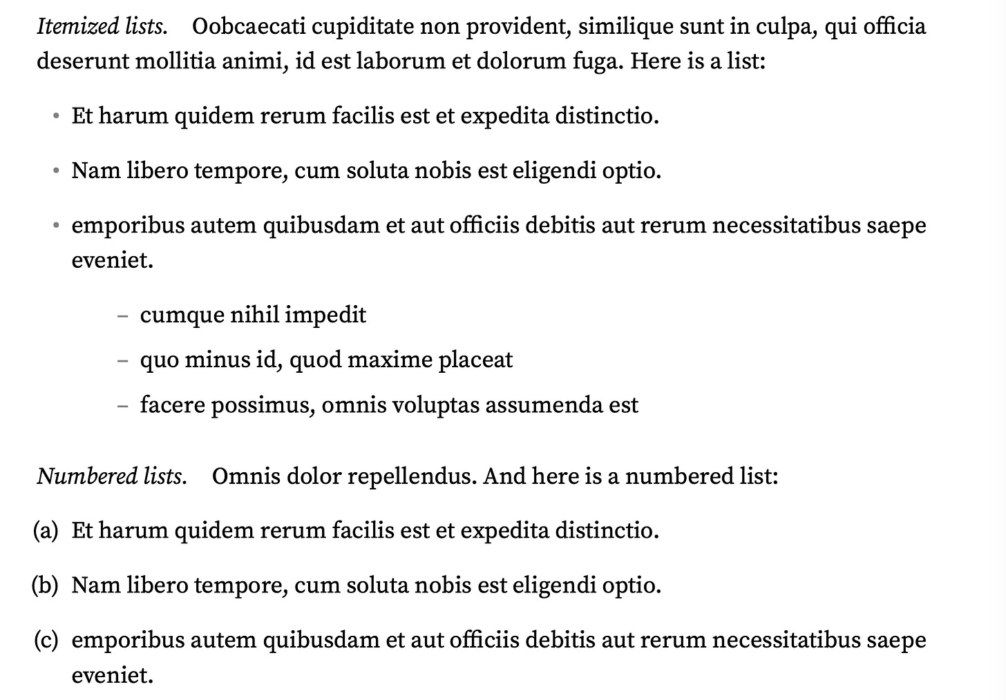
Lists
It is also easy to use itemized or numbered list in the paper template. The lists are customized to fit well with the surrounding text. They look like this:
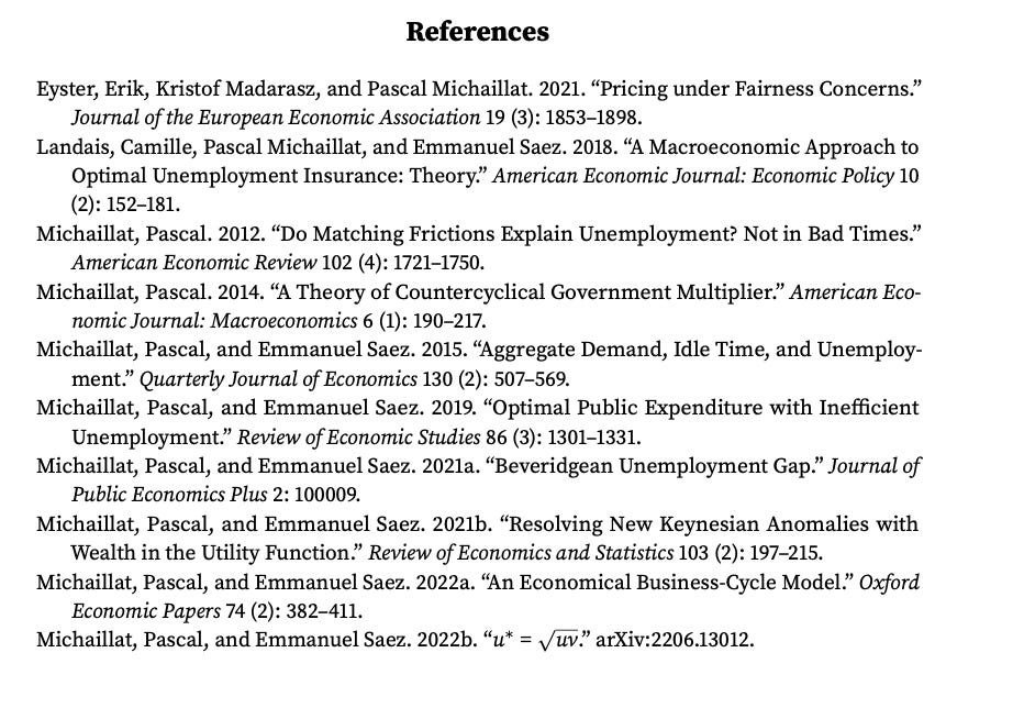
References
The template comes with a style file for the bibliography. The syle file follows the Chicago Manual of Style. The references look like this:
Appendix
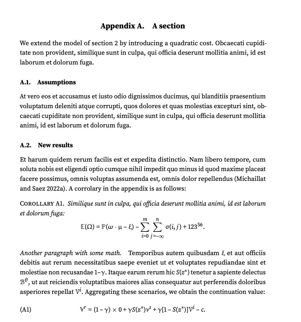
The template is also designed so it is easy to add an appendix at the end of the paper. All the appendix sections are clearly marked “Appendix” and are numbered as appendix A, appendix B, appendix C, and so on. The appendix subsections are also numbered so they can be referred to (for instance, appendix A.1). All numbered items in the appendix are labelled with an “A” so it is clear that they come from the appendix (for instance corollary A1 and equation (A1) below). The appendix looks like this:
Online appendix
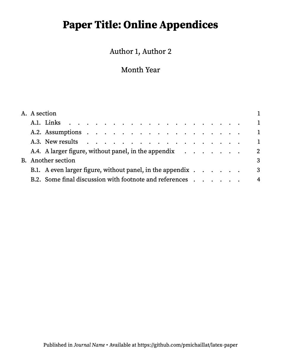
Once your paper gets published you will be asked to transform the appendix into an online appendix. To help with this task, the repository also includes a template for online appendices. It adds two features to the paper template. First, the abstract is replaced by a table of contents:
Second, it allows you to continue using all the references from the paper. So the cross-references from paper to appendix are not broken even though the appendix is now in a separate file.
The paper and presentation templates use related fonts and make similar design choice, so they have a similar look.


