A Minimalist Template for Academic Presentations
It's job-market season. Having clean, easily readable slides is helpful.
It is job-market season in Economics. Job talks have started this week and will be going on for the next two months. If you are a job candidate, you have now polished the content of your presentation. But it might be helpful to revisit how your slides are formatted—to make sure that they are as clean and easily readable as possible.
You have done all the hard work. It would be a shame if your message did not go through just because your slides are cluttered, the text font is too large or too small, the color scheme is distracting, or your mathematical symbols are unreadable.
In this post, I share a minimalist template for academic presentations.
Downloading the template
The presentation template is freely available on GitHub. The repository contains the presentation template, accompanying style files, a presentation example, and a readme file explaining how to use the template.
The template produces slides uses LaTeX Beamer. With Beamer it is easy to insert mathematical expressions and easy to produce tables and graphs. Furthermore, it’s easy to move back and forth between a paper written with LaTeX and a presentation written with Beamer.
Title slide
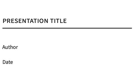
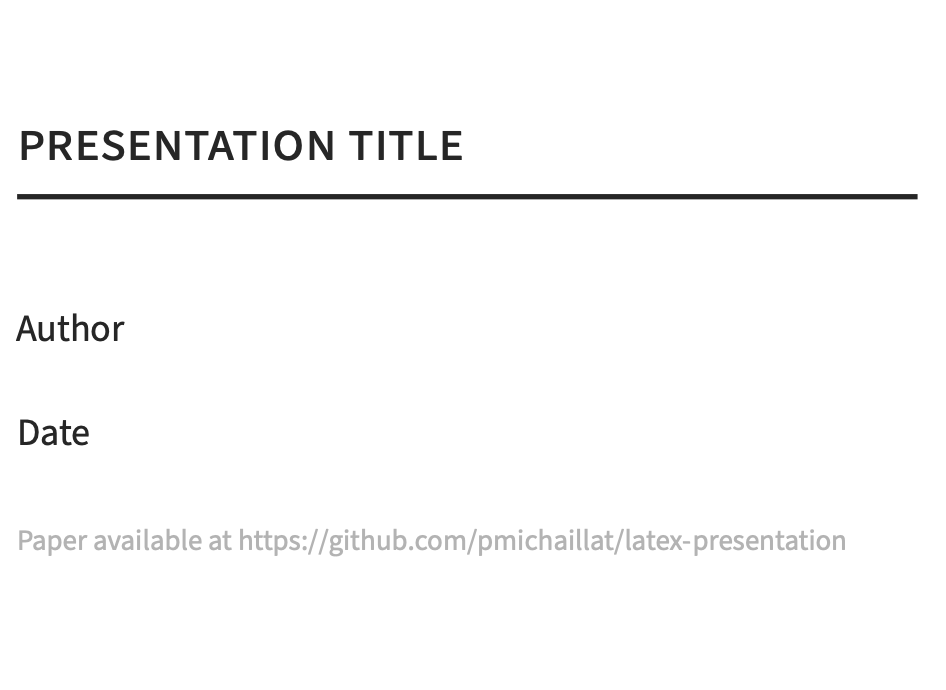
The template’s title slide looks like this:
It avoids centered text and is otherwise pretty minimalist. The template allows you to specify an URL for the paper that you are presenting. When the slides are posted online, the URL allows readers to go from your slides directly to the paper.
4:3 versus 16:9 aspect ratio
There has been a shift from slides with a 4:3 aspect ratio to wider slides with a 16:9 aspect ratio. This template sticks to the 4:3 aspect ratio. First, 4:3 slides work better for online presentations—and these have become commonplace now. But even for in-person presentations, the 4:3 slides work well, because they force presenters to keep the amount of information that they display on slides to a minimum. 16:9 slides are often used to present two graphs at a time, or two paragraphs at a time. This is too distracting for the audience. 4:3 slides display one graph or one paragraph at a time, and that’s enough. Slides are here as support for what you are talking about, not as a substitute.
Text font
Fonts matter in presentations—just as in papers. The font that you pick determines the appearance of the entire presentation. Matthew Butterick has a nice introduction to font choice, including a list of good-looking free fonts.
For the presentation’s text, the template uses Source Sans Pro, which is one of the free fonts recommended by Butterick, and which I like a lot. Source Sans Pro is a sans-serif font. This is an important feature for presentations, as sans-serif fonts are much more readable than fonts with serif in presentations. Another advantage of Source Sans Pro is that it is not part of typical slide templates (unlike Fira Sans for instance). So it feels new and fresh. A last advantage is that there is a with-serif font in the Source Pro family: Source Serif Pro. I use Source Serif Pro in my papers, which gives presentations and papers a similar look.
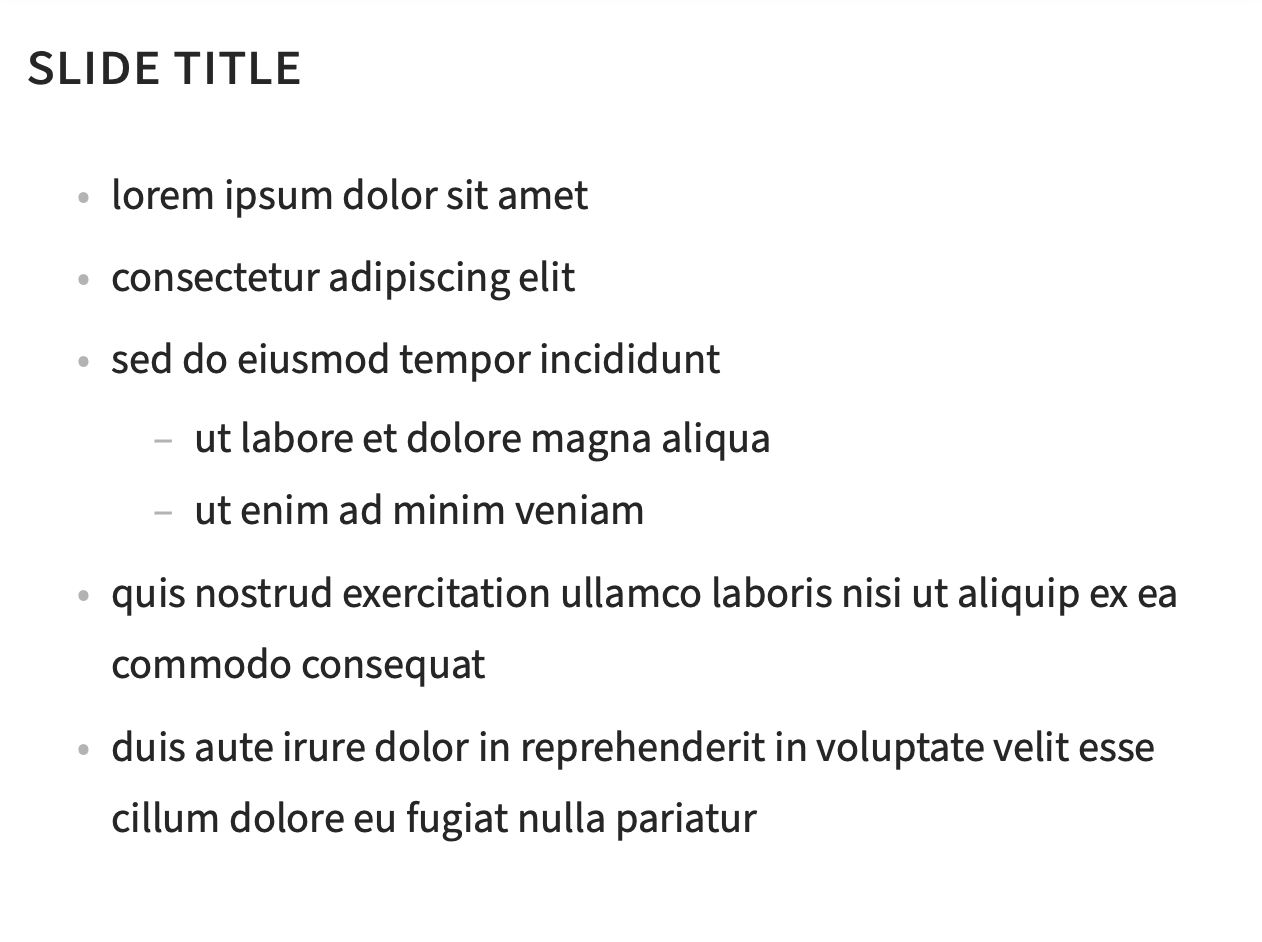
A basic slide with text looks like this:
Math font
LaTeX uses one font for text and other fonts for math. For consistency, the presentation template sticks with Source Sans Pro for roman math. It also uses Source Sans Pro for all the numbers in math. This way you do not get different-looking numbers if you type 1.5 or $1.5$.
There are some sans-serif Greek alphabets, but the letters look unusual and are hard to recognize. So for the Greek letters in math, the template uses the Euler font. These Greek letters look good, have the same thickness as the text letters, and are distinctive.
The template also uses the Euler font for calligraphic letters in math. This calligraphic letters fit well with the other fonts and are very readable.
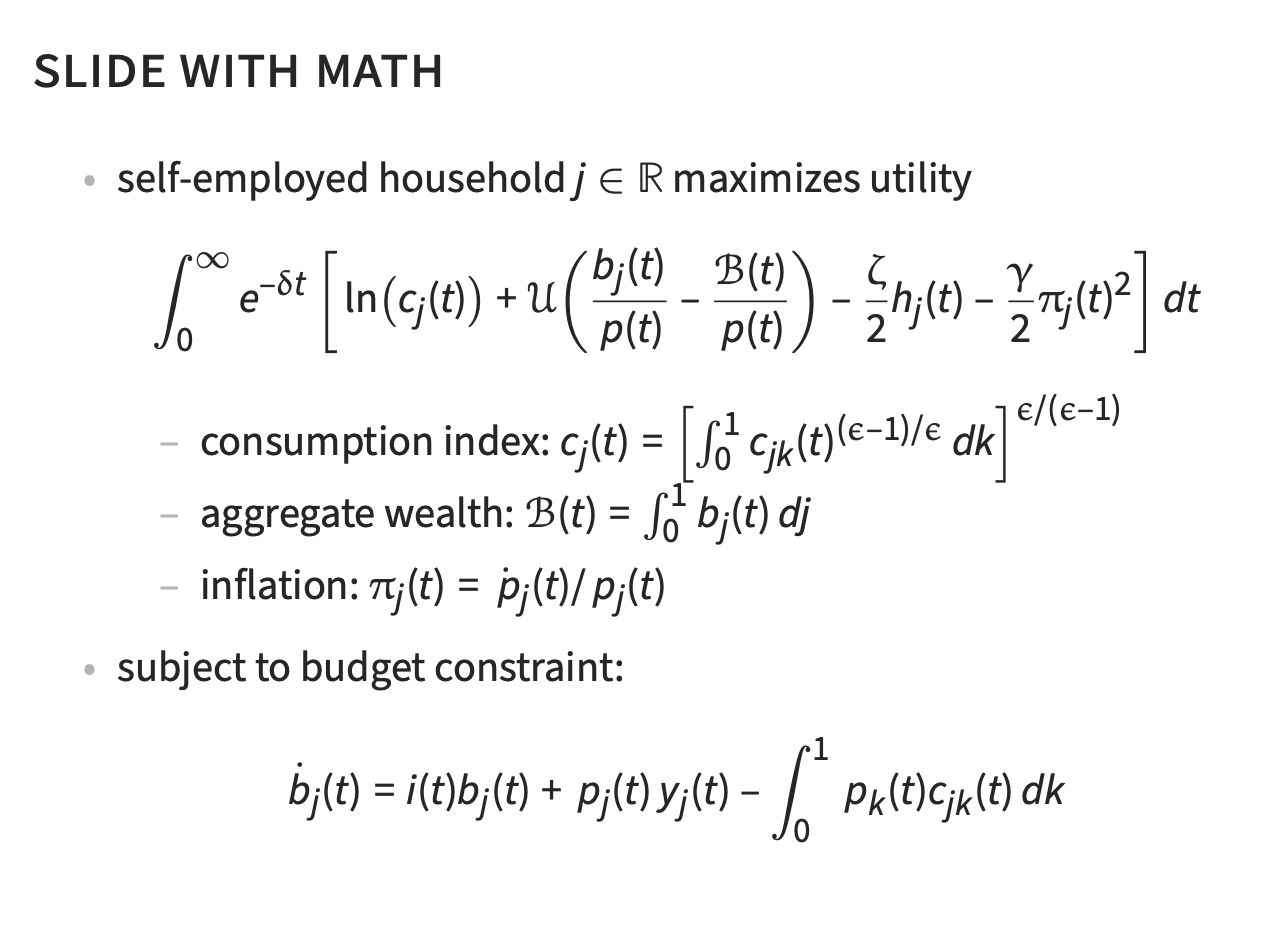
A basic slide with math looks like this:
Font size
The font size is 12pt. It is easily readable but not too big. It follows Butterick’s advice to choose a font size so as to be able to fit about 12 lines of text on one slide.
The template keeps one font size for all text. So the text is not smaller at different levels of itemized lists—which many Beamer themes impose by default but which I find distracting.
Spacing
The spacing is generous: around one and a half spacing. This adds white space to the presentation, which helps with reading, and it limits the amount of stuff that can be written on one slide.
It is fine to have 6–8 bullet points on a slide as long there are only a few words per bullet point.
Headline
The headline is in slightly larger font, in small caps, and aligned left. It makes the headline stand out, is easily readable, but does not take all the attention away from the text.
Butterick recommends to avoid centered headlines, and I agree with that. I would also recommend avoiding very bright color background behind the headline. It makes the headline hard to read and is distracting.
No frills at the periphery of the slides
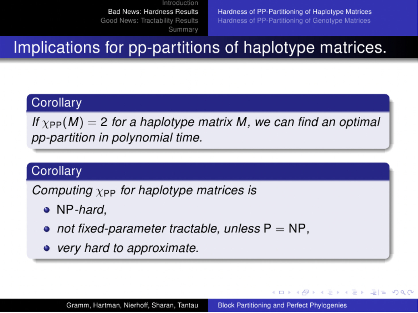
A typical slide produced with Beamer might look something like this:
There is so much useless ink on this slide:
Outline of the talk above the title
Small grey buttons in the bottom right-hand corner
Names of the author and title of the talk at the very bottom of the slide
A lot of dark, sharp color at the top and bottom
Such clutter distracts listeners and takes their attention away from the main message of the slide—while conveying no useful information. The audience does not need that information in the middle of the talk.
The slides produced by the template are devoid of such frills.
Color scheme
As Butterick says, use color with restraint. A lot of colors, especially bright ones, are distracting. To reduce distraction, the template only uses grayscale. The text is in dark gray, but not black to avoid an uncomfortable degree of contrast. The bullet points are in lighter gray, to blend in the background. (I think that the typical, very bright Beamer bullet points should be avoided as they are distracting.)
Colors are reserved for graphs and text alerts. Text alerts are in magenta, which is a color I like a lot. Apparently
Magenta is known as a color of harmony and balance. It’s used in Feng Shui and is often considered spiritual.
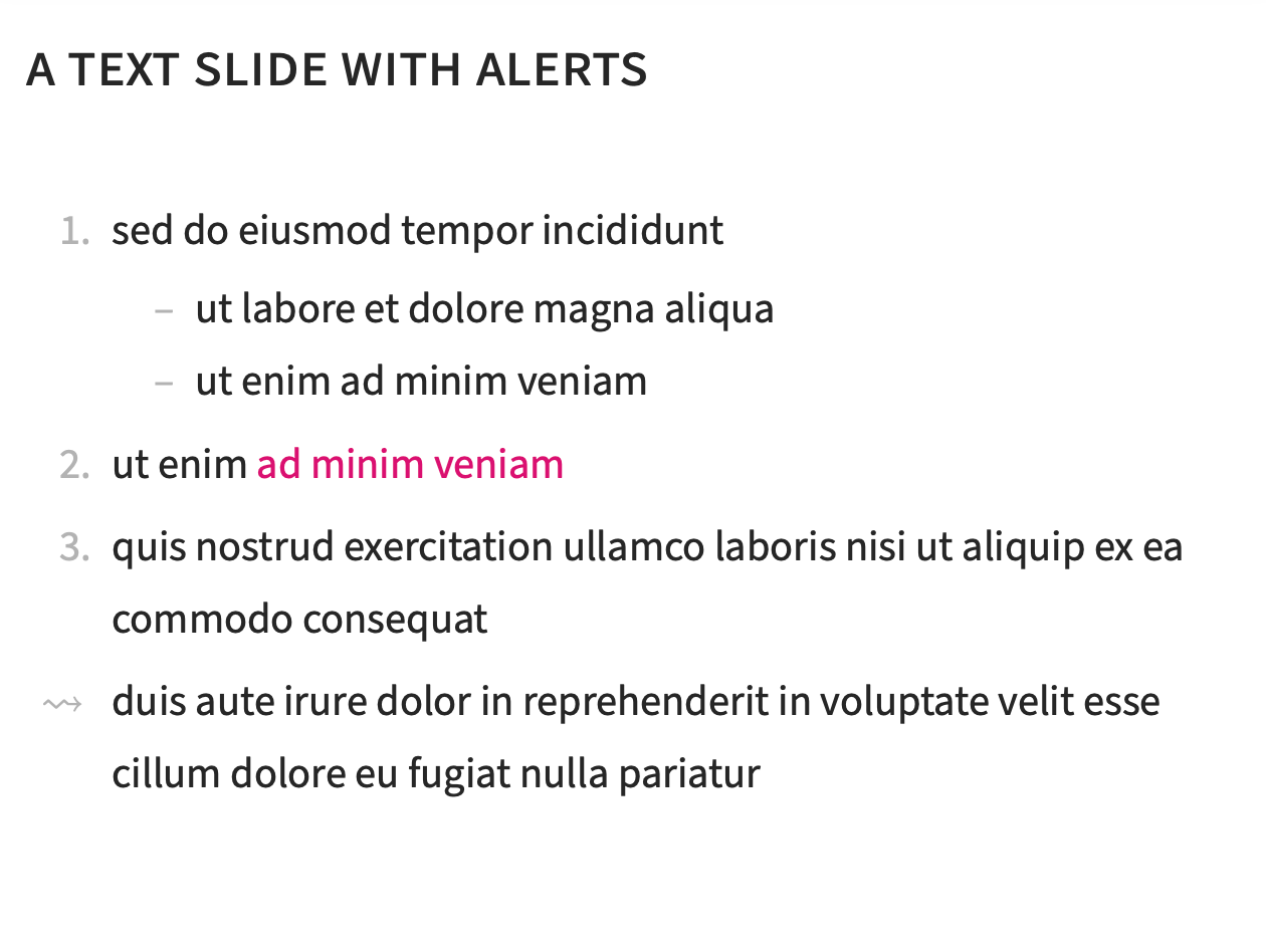
Of course alerts should be used with restraint. Here is a slide with alert:
I would not use bright red for alerts, since it is a color associated with anger, and nobody needs this in a talk.
Figures
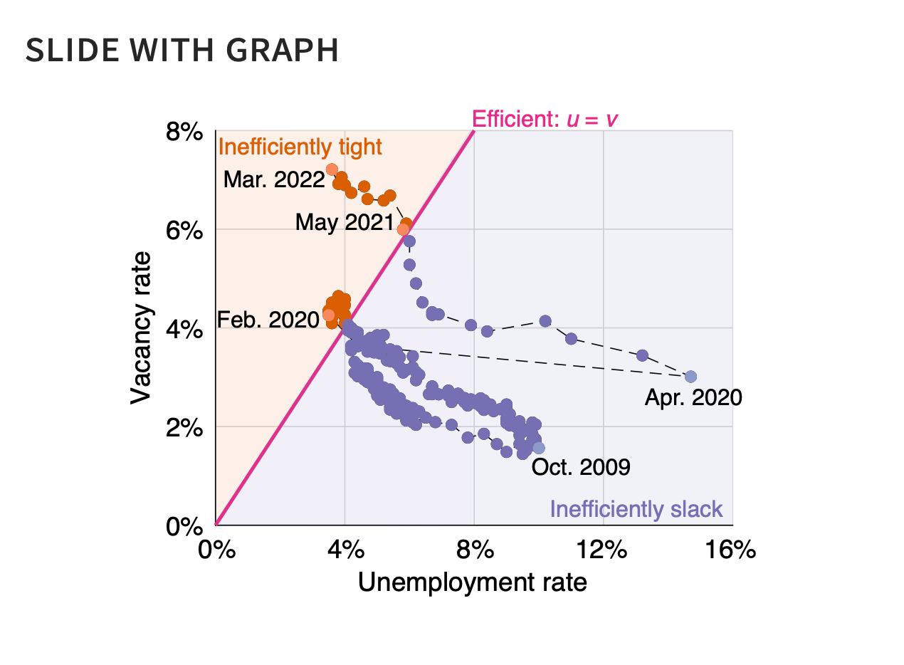
An advantage of avoiding colors in the text is that the colors in figures really stand out. Here is a slide with a figure produced by the template:
There is no need to add a caption to the figure: just use the slide title as caption.
An easy way to insert figures into the template is to create a PDF file with all the figures that are featured in the presentation. An easy way to do that is to create a Keynote or Powerpoint presentation; insert each figure as a slide background; and save the resulting presentation as PDF. With this method, all the figures have the exact same size. It is also possible to use Keynote or Powerpoint to annotate easily the figures created with an external software (Matlab, R, and so on). In the slide above the graph is produced with Matlab but all the dates are inserted with Keynote.
Try to use sans-serif font in the figures as well—it improves readability. Try to choose a font size in the figures so the figure text has the same size as the slide text. This way you are sure that the figure will be easily readable. And make sure that axes and data points are labelled in a self-explanatory way.
The template uses a white background for slides because figures have white backgrounds. Figures therefore seamlessly blend into the slide. With a colorful slide background, the figures background would stick out.
Tables
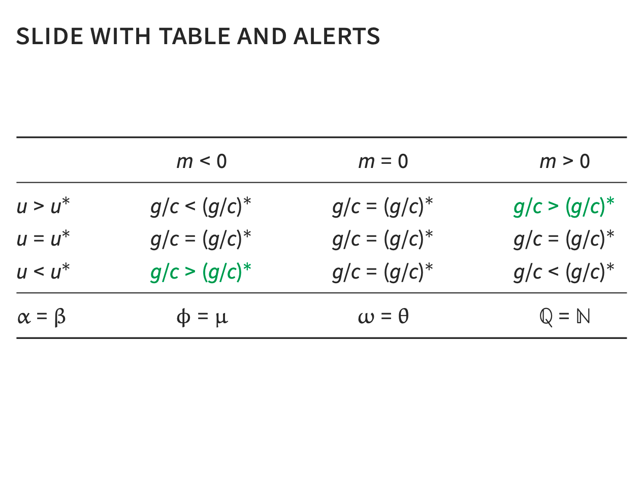
It is very easy to produce tables with the template. A slide with a table looks like this:
People sometimes copy-paste table from their paper into their slide. That’s not a good idea since it is not possible to read large tables with tiny numbers on slides. My advice is to stick to the same font size, and just present the key numbers from the paper table. If listeners want more details, they will go to the paper.
Section slide
The template allows you to separate your talks into sections. This adds structure to longer talks. The section slide looks like this:
The section slide is a good point to stop, recap what you have already showed, and discuss what you will show next. It is also a good point to take questions.
Last slide
The template also come with a last slide, which is a just a gray square. I use it instead of conclusion slides—to say thank you, recap in a sentence what I have showed, and discuss next steps or related projects.
I have always found conclusion slides to be ineffective or even mildly upsetting. The audience has been listening to us for an hour or an hour and a half: they know what we have just told them. At that point they are happy to go on with their day.

